The story behind Transport
By company founder Andy Allan
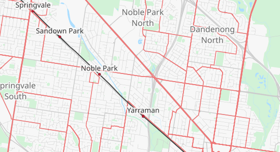
There’s been many iterations for Transport over the years, particularly the technologies we use. It’s traditionally our ‘pathfinder’ style, so it was the first to use CartoCSS, and the first to be powered by vector tiles.
As well as changing the behind-the-scenes technologies, we keep working on the cartography too. Finding better ways to show overlapping bus routes is a current priority, along with adding and refining the more unusual types of public transport, like funiculars, cable cars and chairlifts.
In some cities, outdoor escalators and public elevators are part of the public transport network as well.
Clarity in Cartography
This simplification of the cartography is one of the great strengths of the Transport map, since it really allows the transport-related items to stand out.
Transport looks quite different from our other layers. There are only two categories of roads and all the paths look similar. Compare this to OpenCycleMap, where there are about 7 different categories of road and 4 categories of paths.

Challenges in Complexity
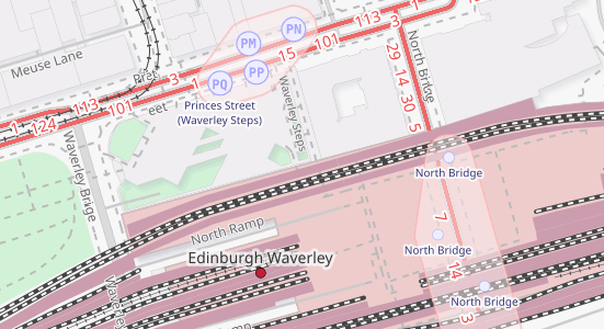
The main challenge with Transport is dealing with complicated interchanges, like large stations in urban areas. Different people (or the same person on a different journey) can be interested in different transport features, like platforms on a surface station, or the routes of a metro system, or the passageways connecting the two.
For large interchanges these can often overlap each other, and we don’t yet have a perfect answer for showing these places on a flat, one-layer map. We’re working on it!
I’m most proud of the bus stop zones. This is where we examine the individual bus stops, find the ones with the same names, and draw a smooth highlight around them. This grouping works without OpenStreetMap contributors having to add any relations linking them together. We do the hard work instead.

A Dark Style, Not Just Inverted
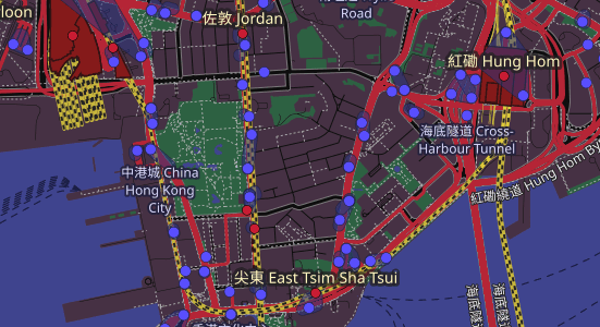
I initially created the Transport dark style as a technology demo as to how easily we could create customer styles. I really like the cartography it shows though. It’s not just a simple inversion of colours, like so many other dark schemes. The green spaces are still green and the railways switch from black to yellow – it’s definitely not a simple colour filter.

Our Transport dark style has inspired some of our custom cartography customers, who were looking for dark styles to fit in with the theme and colour schemes of their own applications and projects. It is also now available to all our customers as a standard map.
Get started with Transport Preview Transport
Free plan available - no credit card required